Home Blog Design The Rules of PowerPoint Presentations: Creating Effective Slides

The Rules of PowerPoint Presentations: Creating Effective Slides
Creating a PowerPoint presentation can seem straightforward, but several essential rules must be followed when the goal is to deliver something truly compelling. These guidelines ensure that your presentation slides are visually appealing and serve their primary purpose: clearly communicating your message to evoke an emotion.
In this article, we will cover 14 rules that differentiate an amateurish presentation from a professional one. Each rule will include tips on how to implement it.
Table of Contents
Keep It Simple
Consistent design matters, use visuals wisely, focus on readability, limit text per slide, data presentation should be clear, use animations sparingly, use white space effectively, prepare a strong opening and closing slide, test for cross-platform compatibility, always include a call to action, stay within time limits, plan the flow of information, balance between text and visuals.
This is a no-brainer. Complex or cluttered slides overwhelm your audience and detract from your message. Every element on the slide should have a clear purpose. Too much text, excessive animations, or irrelevant images will distract rather than enhance your presentation.
When preparing presentation slides, always focus on the key message of each slide. Ask yourself, “Does this support my point, or is it just noise?” Simplifying your content makes your presentation more engaging and easier for your audience to follow.
- Use bullet points rather than paragraphs.
- Limit each slide to one key idea or point.
- Avoid unnecessary effects like transitions between every slide.
- For more information on creating a truly compact presentation, check out our article on the 10-20-30 rules for presentations .
A well-designed slide deck should have a uniform look throughout the presentation. A consistent color scheme, font selection, and layout make your slides aesthetically pleasing and help the audience stay focused on the content.
A mismatch of fonts, colors, and slide layouts gives the impression of a disorganized presentation or lack of skill. You don’t have to be a designer to accomplish this; just stick to a PowerPoint template and get the design decisions sorted out for you.
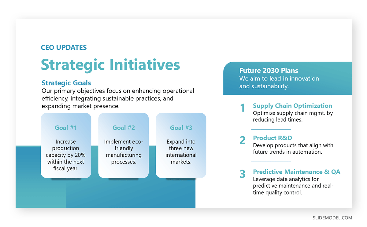
- Stick to one or two fonts (e.g., a sans-serif font for headers and a serif font for body text). Check out our guide on the best PowerPoint fonts for more information.
- Use a limited color palette (three to four complementary colors).
- Ensure that each slide follows a similar layout for headings and content placement.
- Our color theory for presentations article can guide you about the psychological factors of certain colors and how to create color combinations.
Visuals are critical to any good presentation slides PPT, but they should be used thoughtfully. Images, charts, and diagrams help illustrate points in a way that words alone cannot. However, overusing visuals or choosing inappropriate ones can be counterproductive in terms of visual communication .
The rule is to use visuals that support your content. For instance, opt for a simple, well-labeled chart rather than a wall of numbers when discussing data. Pictures should reinforce your message, not distract or confuse the audience.
- Choose high-quality images that relate directly to your content.
- Make sure charts and graphs are easy to read with clear labeling.
- Avoid clipart and overly decorative elements. Instead, opt for high-quality vector images for PowerPoint .
Effective PPT presentation slides must be easily read, even from the back of the room or during a virtual presentation. Small or overly intricate fonts can make it difficult for your audience to follow along.
Ensure that text stands out against the background, with a strong contrast between the font color and slide background. A good rule is to avoid bright or overly complex backgrounds that can obscure text.
- Use a minimum font size of 24 points for body text.
- Stick to simple fonts like Arial, Calibri, or Helvetica.
- Avoid placing text over busy backgrounds.
- Don’t use intense contrast between text and background. Websites like WebAIM color contrast checker are ideal to ensure you work with the appropriate hues.
Your slides are not a presentation transcript; they should provide highlights and key points, not the entire content.
Slides packed with text are hard to read and tempt your audience to start reading rather than listening to what you’re saying. Stick to the idea of “less is more” when preparing good presentation slides.
- Use short bullet points or brief phrases instead of full sentences.
- Aim for no more than 5-7 lines of text per slide.
- Highlight key points, not entire explanations.
- Apply the Feynman technique to simplify explanations.
If your PowerPoint presentation includes data, it must be presented in a way that’s easy to understand. Avoid dense tables of figures and opt for simple, clean charts and graphs that visually communicate the data.
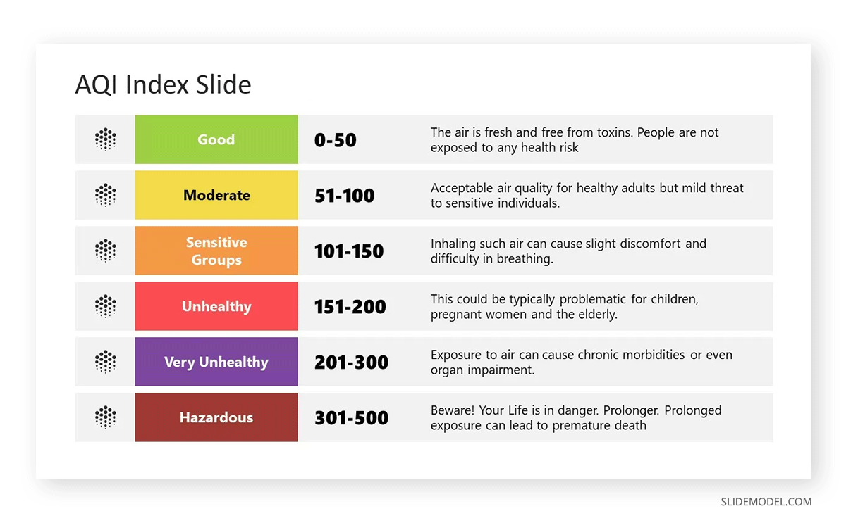
Good presentation slides ensure that every data point supports your narrative. Clarity is the number one winning factor when presenting sales growth, research findings, or market trends.
- Use charts that match the data type: bar graphs for comparisons, pie charts for proportions, etc.
- Label axes and data points.
- Avoid 3D charts that can distort data visualization.
- Check our guides on data presentation and data storytelling to structure your data in the most appropriate format.
While animations and transitions can add a dynamic element to your presentation, they should be used sparingly and with a clear purpose. Overuse of these effects can make a presentation look unprofessional and distracting.
The best practice is to use simple transitions, such as fades or wipes, to move between slides smoothly. Animations within slides should be used to emphasize important points or guide the audience’s attention, not as a constant feature of your effective PPT presentation slides.
- Stick to one type of transition throughout the presentation.
- Use animations only to highlight important data or concepts.
- Avoid overly complex or distracting animations.
- These effects are not restricted to PowerPoint. Learn how to use Google Slides animations .
White space, or the empty space on a slide, is just as important as the text and visuals. It gives your content room to breathe and prevents the slide from feeling overcrowded.
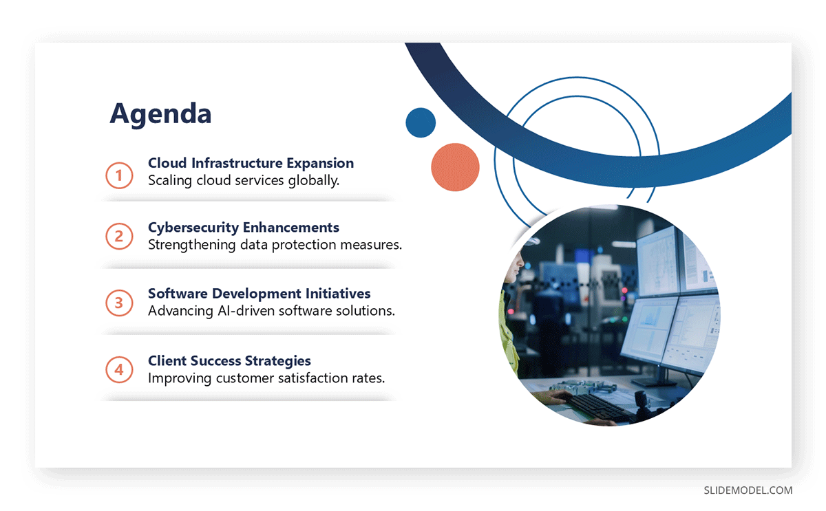
Proper use of white space can make your good presentation slides more professional and easier to read. It allows the audience to focus on the key points rather than trying to decipher a crowded slide.
- Leave margins around the text and visuals to balance them. If you plan to print your slide deck, consider safe areas, margins, and bleed.
- Avoid filling every inch of a slide with content.
- Use white space to separate different elements for clarity.
The first and last impression is critical in any PPT presentation. Your opening slide sets the tone for the entire presentation, while your closing slide provides the final takeaway.
Keep the opening clean and straightforward, introducing the topic without overwhelming details. The closing slide should summarize the main points and leave a lasting impact, perhaps with a call to action or final thought.
- Use a simple title slide to start your presentation .
- Include key takeaways or a strong conclusion in your closing slide.
- Avoid introducing new information in the final slide.
Sometimes, formatting, fonts, or multimedia may not translate well between systems, leading to errors during the presentation. For users who consistently work with Google Slides templates , this may not be an issue, but if PowerPoint or Keynote are your presentation software options, then it’s best to stick to the safe side.
- Test your presentation on both Mac and PC platforms.
- Use standard fonts that are available across different operating systems. If not, opt for Google Fonts.
- Embed fonts or convert your presentation to PDF format to avoid compatibility issues.
If your presentation has a purpose beyond delivering information—such as inspiring action or driving decisions—your final slide should include a clear call to action slide . This will direct your audience to what to do next, ensuring that your message has a lasting impact. It can be as simple as just adding a banner slide to seduce prospective clients about your upcoming offers.

- Use action-oriented language like “Sign up,” “Start now,” or “Contact us.”
- Provide clear instructions or next steps for the audience to follow.
- Keep the call to action simple and easy to follow.
- Bold colors help to guide the audience toward the CTA button or phrase.
When preparing your presentation slides, keep the time constraints in mind. While the content may be detailed and relevant, your presentation must fit within the allocated time to avoid rushing or cutting key information.
- Time yourself when rehearsing to ensure you stay within limits.
- Trim unnecessary slides or points if your presentation exceeds the allowed time.
- Use visual cues, like a progress bar or section divider slides, to show time management.
The presentation structure of your slide deck should guide the audience through your argument or story step by step. Start with an introduction, move into your key points, and conclude with a summary or call to action. Jumping between unrelated points can confuse the audience, so the order of your slides matters as much as the content.
- Plan your slides in a way that builds on the previous information.
- Ensure smooth transitions between sections.
- Use summary slides to reinforce key points at the end of each section.
As with everything in life, going overboard or coming up short has consequences. Too much of either of these elements can make your slides overwhelming or too simplistic.
When considering how to make effective presentation slides, always think about how the text and visuals can work together to reinforce the main message. If a visual alone can convey the point, limit the text to a title or supporting bullet point.
- Pair concise text with a relevant visual.
- Avoid slides that are entirely visual or entirely text-based.
- Maintain a clear hierarchy by using larger fonts for headings and smaller ones for supporting text.
Like this article? Please share
Presentation Ideas, Presentation Tips Filed under Design
Related Articles

Filed under Business • November 6th, 2024
Meeting Agenda Examples: Guide + PPT Templates
Are you looking for creative agenda examples for your presentations? If so, we invite you to discover the secrets to creating a professional agenda slide.
Filed under Design • October 17th, 2024
Architecture Project Presentation: Must-Know Secrets for Creative Slides
Impress your audience by mastering the art of architectural project presentations. This detailed guide will give you the insights for this craft.

Filed under Google Slides Tutorials • October 16th, 2024
How to Add Voice Memos to Google Slides
Make your slides more interesting by learning how to add voice memos to Google Slides presentations. Step-by-step instructions here.
Leave a Reply
Click to copy
Email copied!
How to make the best Powerpoint presentation + real examples!
July 1, 2023

Ever sat through a PowerPoint presentation and thought, "Wow, that was mind-blowing"? Yeah, us either. But, let's face it, we've all been there—either on the giving or receiving end of a less-than-stellar presentation. It's high time we changed that narrative. Creating your best PowerPoint presentation isn't just about throwing together a bunch of slides – it's an art. It’s about telling a story that captivates, informs, and even entertains your audience.
A new age is upon us, and it’s time to explore the ins and outs of what makes a PowerPoint presentation not just good, but great. From nailing your content and story flow to the nuances of design and delivery, we've got you covered. So, whether you're gearing up for that crucial sales pitch or prepping for an all-important investor meeting, buckle up! Your presentation skills are about to go from mundane to magnificent.
Your Presentation Should Tell a Story
When it comes to creating a killer PowerPoint presentation, it all starts with the story. You heard that right! Not the fancy animations or the snazzy graphics (though they do have their place), but the story. It’s the backbone, the foundation, the heartbeat of your presentation.
Think about how you feel when you watch your favorite TV show or read a book you can’t put down. Good storytelling takes us to another place, where the rest of the world slips away and the story steps into the forefront. Great presentations can do the same thing if the presenter can harness the power of storytelling.
There are also plenty of science-backed reasons to prioritize good storytelling. One article by Lani Peterson for Harvard Business Corporate Learning says, “Scientists are discovering that chemicals like cortisol and dopamine are released in the brain when we’re told a story. Why does that matter? If we are trying to make a point stick, cortisol assists with our formulating memories. Dopamine, which helps regulate our emotional responses, keeps us engaged.“ More engagement; more impactful presentations.
So, how do you nail down a storytelling strategy that sticks? Let’s break it down.
Craft Your Narrative
First, identify your core message. What’s the one thing you want your audience to remember when they walk out of the room? This is your North Star, guiding every aspect of your presentation. If you’re having trouble with this step, ask yourself, “Why am I giving this presentation?”
Understand Your Audience
Who is your audience? Tailor your story to resonate with them. Are they tech-savvy millennials or industry veterans? Your story should speak their language. Presentations that skip this step will miss out on a crucial opportunity to connect with the audience. And if you can’t connect with them, then what’s the point? One solution is to focus on understanding the needs, challenges, and aspirations of your audience. That way, you’ll be able to address their specific pain points and interests.
Create a Structured Flow
Like any good story, your presentation needs a beginning, middle, and end. Start with an introduction that hooks, follow with content that informs and engages, and conclude with a memorable takeaway. If you need ideas on how to start your presentation, see this guide with 12 ideas for hooking your audience from the very start .
Find Inspiration
Look to the pros! Ever read an article by Andy Raskin or April Dunford ? These folks know their stuff when it comes to strategic narratives. Dive into their work for some inspiration on how to weave a compelling story in your presentation. Just like we’ve all been through our fair share of boring presentations, most likely you’ve experienced a presentation that left an impression. Ask yourself why it was so impactful–you might be able to draw from their expertise!
Change the Narrative
Say you’re working on a sales deck. Instead of going with the typical problem-solution story structure, Andy Raskin has a different take on it:
Start with a big, relevant shift in the world. “We are living in a new era” type of statement. This will grab the attention, but also create some urgency for the prospect.
Then you move on to show that there will be winners and losers in this new era. The ones who act on this shift will have more probability of winning. In other words, “what I am about to offer you is crucial for winning in this new era.”
Now that you have set the stage, you can “tease the promise land” as Andy calls it. This is not where you show your product features. This is simply a teaser about this new future state and what to expect if you react to this shift in the market.
Then, you highlight the “Old world vs New world” to show the contrast, and how old methods do not work in this new era.
And finally, you provide real-life stories to support your claims. These could client case studies, article snippets, industry updates - anything that adds credibility to everything you just said.
Voilà, you’ve got yourself a story arc! This is a simple and straightforward way to craft a story that connects.
Nail Your Story First
Remember, at the end of the day, your presentation is more than just a collection of slides, but rather a vessel for storytelling. It’s not just about what you say, but how you say it. A well-crafted story can transform your presentation from a mere transfer of information to an impactful, memorable experience. So, take the time to nail your story, and you’re already halfway to creating your best PowerPoint presentation. Your audience will thank you!

Embracing Professional Design for Impactful Presentations
When you've nailed your narrative, the next crucial step in crafting your best PowerPoint presentation is design. This stage is where your story gets visually translated, elevating it from a mere script to an engaging, compelling experience.
The Role of a Presentation Agency
Not everyone possesses an innate talent for design, and that's perfectly fine. This is where a presentation design agency can become an invaluable asset. These presentation experts act as the alchemists of your PowerPoint, transforming basic slides into visually stunning and strategically aligned pieces of art. However, be selective when you choose who to work with. There is a big difference between a "meh" designer vs a “wow” designer when it comes to preparing well-crafted presentations.
Simplifying Complexity
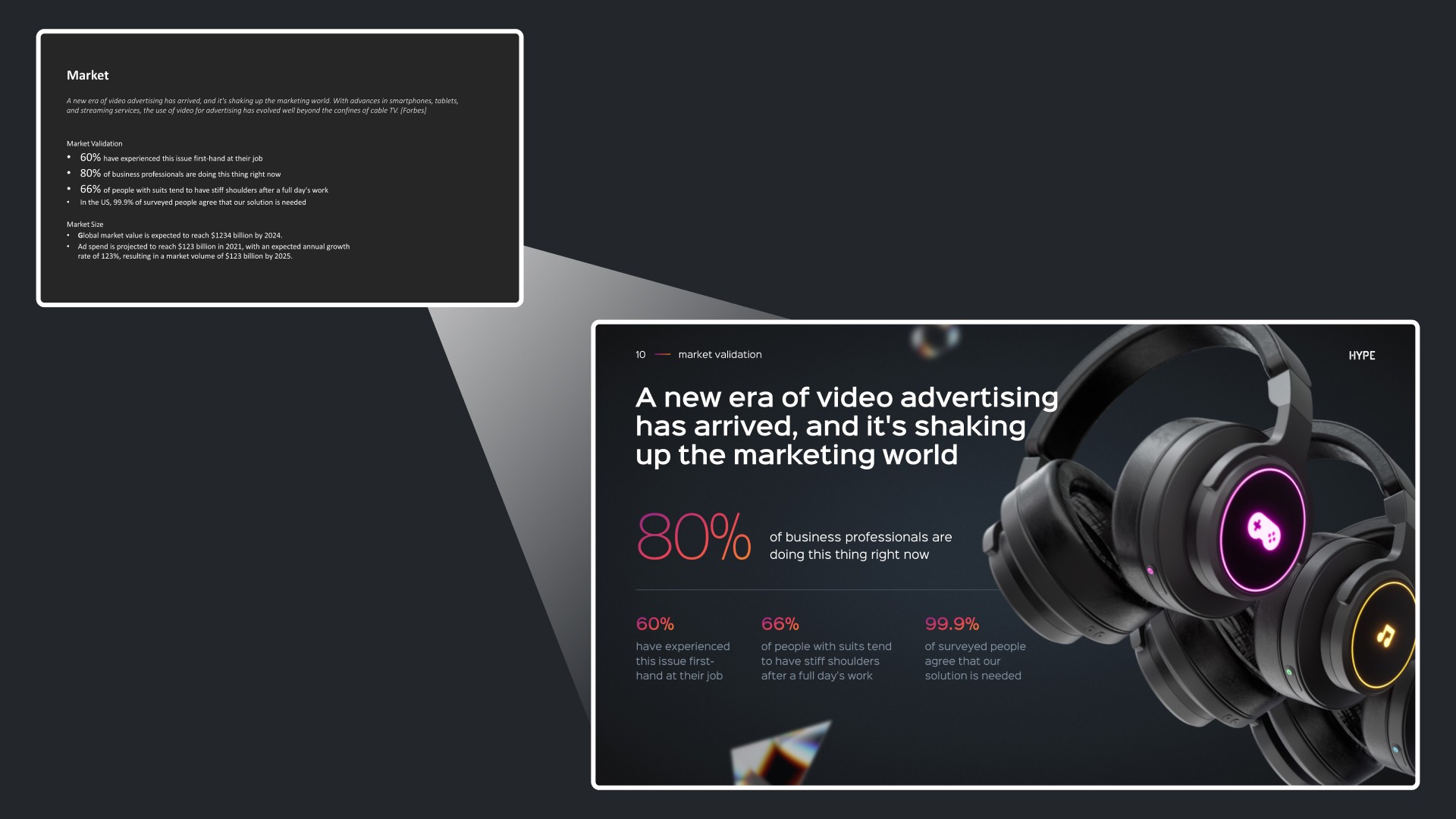
One of the critical talents of a presentation design agency is their ability to distill complex concepts into simple, digestible visuals. An overcrowded slide can quickly lose your audience's attention, but a well-designed one can convey your message succinctly and effectively. Not only that, presentation experts can remove the complexity of creating great slides by designing the best presentation templates for your needs, making the process easier for you in the end.

"We have been using SLIDES™ services for our corporate PowerPoint template, and the PPT template is so well done and easy to use that we all feel like we now have PowerPoint superpowers creating new presentations in no time with stunning look!"
Jérôme neuvéglise, product owner qoqa, creating visual harmony.
Consistency in your presentation’s visual elements - such as color schemes, typography, and imagery - is essential. A presentation design agency ensures that these elements work in harmony, creating a unified and professional look that enhances your overall narrative. The best presentation layouts are those created by experts who know how to make your brand stand out.
Visualizing Ideas Effectively
Presentation agencies excel in translating your ideas into impactful visuals. They ensure that your graphics, charts, and images aren't just visually appealing but also contribute significantly to the telling of your story. After all, why spend so much time honing your story if your visuals fall flat?
When to Opt for Professional Presentation Design
We know that deciding to outsource is a tough call, and you want to make sure your resources are well spent. Here are a few things to consider before seeking out help from a presentation agency:
High-Stakes Presentations
For presentations that can have a significant impact on your business - such as those in sales, partnerships, or investment pitches - professional design isn't just a luxury, but a necessity. These are the scenarios where the expertise of a presentation design agency can make a substantial difference.
Stripe’s CEO Patrick Collison said in a recent podcast:
“My intuition is that more of Stripe's success than one would think is down to the fact that people like beautiful things and for rational reasons. Because, what does a beautiful thing tell you? It tells you the person who made it really cared, and you can observe some superficial details, but probably they didn’t only care about those and did everything else in a slapdash way. So, if you care about the infrastructure being holistically good, indexing on the superficial characteristics is not an irrational thing to do.“
Oftentimes in presentations, we ignore how we are making people feel with our slides. Think about this quote next time you’re preparing your slides.
Overcoming Skill and Time Constraints
If you're not well-versed in design or if time constraints are tight, opting for professional help is a wise decision. This not only ensures quality but also frees you up to concentrate on refining and rehearsing your presentation. This guide shows 18 of the most common presentation mistakes people make, and gives tips on how to avoid them.
In essence, professional design is about giving your presentation the visual edge it needs to not just capture but also maintain your audience's attention. By considering the services of a presentation design agency, you're ensuring that your presentation is not just seen, but also remembered and appreciated.
Mastering the Art of Delivery
Alright, you’ve got a gripping story and a set of stunning slides. But wait! There’s still a crucial piece of the puzzle left – your delivery. This is where the rubber meets the road. Remember, no matter how dazzling your slides are, they can’t rescue a lackluster delivery.

More Than Just Slides
First things first, let’s get one thing straight: people aren’t just buying into your PowerPoint. They’re buying into you – your ideas, your enthusiasm, your conviction. Your slides are merely a tool to complement your narrative, not the other way around. Your slides are never the star of the show. It's you. It sure is harder to improve your delivery compared to your slides. But it will be the best investment of your life.
The Human Connection
At its core, a great presentation is about making a connection with your audience. It’s about storytelling, not just through words on a slide, but through the way you present them. Your tone, your body language, your ability to engage – all these elements combine to create a compelling delivery.
Know Your Story Inside Out
Your first step should be to know your story like the back of your hand. This doesn’t mean memorizing your script word for word but being familiar enough with your content to speak confidently and fluidly about it.
Rehearse, Then Rehearse Some More
Practice might not always make perfect, but it sure does make confidence. Rehearse your presentation multiple times. This will help you iron out any kinks in your delivery and help you manage those pesky nerves.
When our founder Damon gave his first keynote presentation, he experienced some technical issues that would throw off any professional speaker. But since he had rehearsed his speech so well, he knew it inside out. And he could handle the mishap with calm, make some jokes about it, and then get back to his talk when the tech decided to work again.
Engage With Your Audience
Remember, a presentation is a two-way street. Engage with your audience, ask questions, and encourage participation. This interaction makes your presentation more memorable and impactful. The former product manager at Netflix , Gibson Biddle, shared this great example:
“In a virtual setting you need to double-down on engagement tactics. Today, I use Google Slides plus Slido to do real-time polling, word clouds and to answer questions. It makes the experience incredibly interactive to the extent that I now have an equal NPS for virtual and in-person presentations.”
Body Language Matters
Your body language speaks volumes. Maintain eye contact, use gestures to emphasize points, and move around if possible. This non-verbal communication can significantly enhance the impact of your delivery.
In today’s increasingly digital world, we also have to think about virtual presentations and how to put our best foot forward through a screen. An awkward camera angle or a weird background can be a distraction to your audience, so shift your focus to a flattering camera angle, solid camera quality, and a neutral background.

Authenticity is Key
Be yourself. Your audience can tell when you’re putting on a façade. Authenticity breeds trust and connection, which in turn makes your message more persuasive.
Investing in Yourself
Finally, investing in your delivery skills is investing in yourself. Whether it’s through public speaking courses, professional coaching, or simply seeking feedback from peers, improving your delivery skills is invaluable. Remember, a great delivery can elevate a good presentation to a great one. So, give your delivery the attention it deserves, and watch as you transform from a presenter to a storyteller, captivating your audience one slide at a time.
Final Thoughts
So, there you have it – the roadmap to creating a PowerPoint presentation that’s not just good, but outstanding. It all starts with crafting a compelling story, enhanced by visually striking and well-thought-out design, and brought to life through engaging and authentic delivery. Remember, your best PowerPoint presentation will feel like more than just a collection of slides to your audience. This is a powerful storytelling tool, and you are the storyteller.
The key takeaway? Invest time and effort into each aspect of your presentation. Understand your narrative, collaborate with design professionals if needed, and hone your delivery skills. It’s this combination of content, design, and delivery that transforms a standard presentation into an unforgettable experience.
In the end, what sets a great PowerPoint presentation apart is the ability to not just share information but to tell a story that resonates, inspires, and persuades. Whether you’re pitching to potential clients, investors, or sharing insights with your team, remember that the most impactful presentations are those that connect with the audience on a deeper level. So go ahead, create, deliver, and captivate.
Your audience is waiting.
Recent articles
View all articles
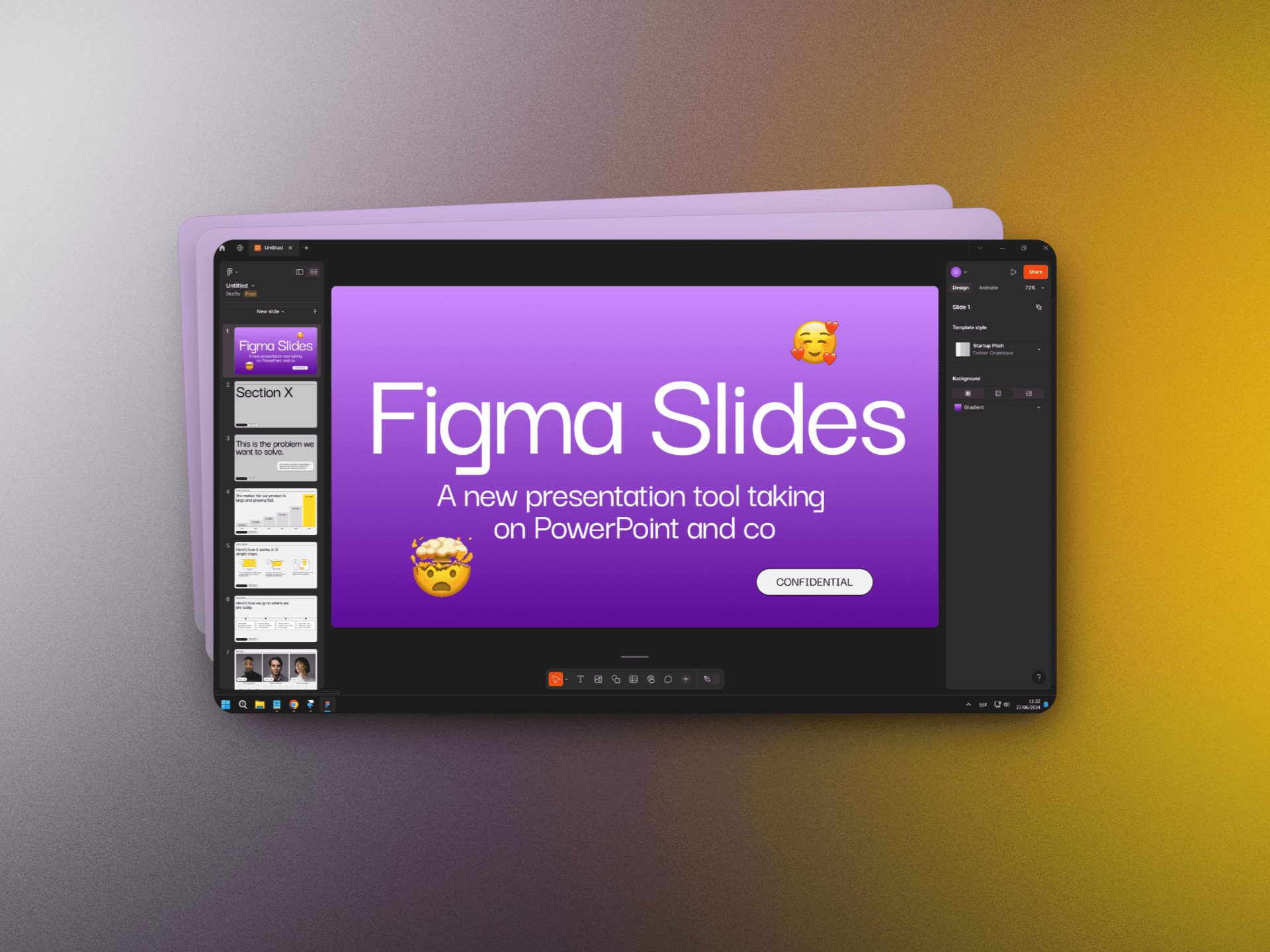
Figma Slides: A new presentation tool taking on PowerPoint and co
Presentation tools

How to prepare a great conference keynote presentation
Public speaking
