

10 Bad PowerPoint Slides Examples to Avoid
A presentation serves two purposes: 1) it teaches your audience something new and 2) motivates them to take action. However, achieving these goals is only possible if your audience is engaged in your presentation. Your presentation is your story, whether hosting a webinar, teaching an online course, training a new employee, pitching a business idea, or sharing a project with your team.
What you say matters; your audience’s attention matters. A successful presentation determines how many people connect with your story, how much they remember, and improvements for next time. Various elements in a presentation can make or break its look. Knowing and avoiding practices that can make your presentation dull and non-engaging is vital.
We’ll walk through some examples of bad PowerPoint Slides to help you avoid common mistakes while creating a presentation.
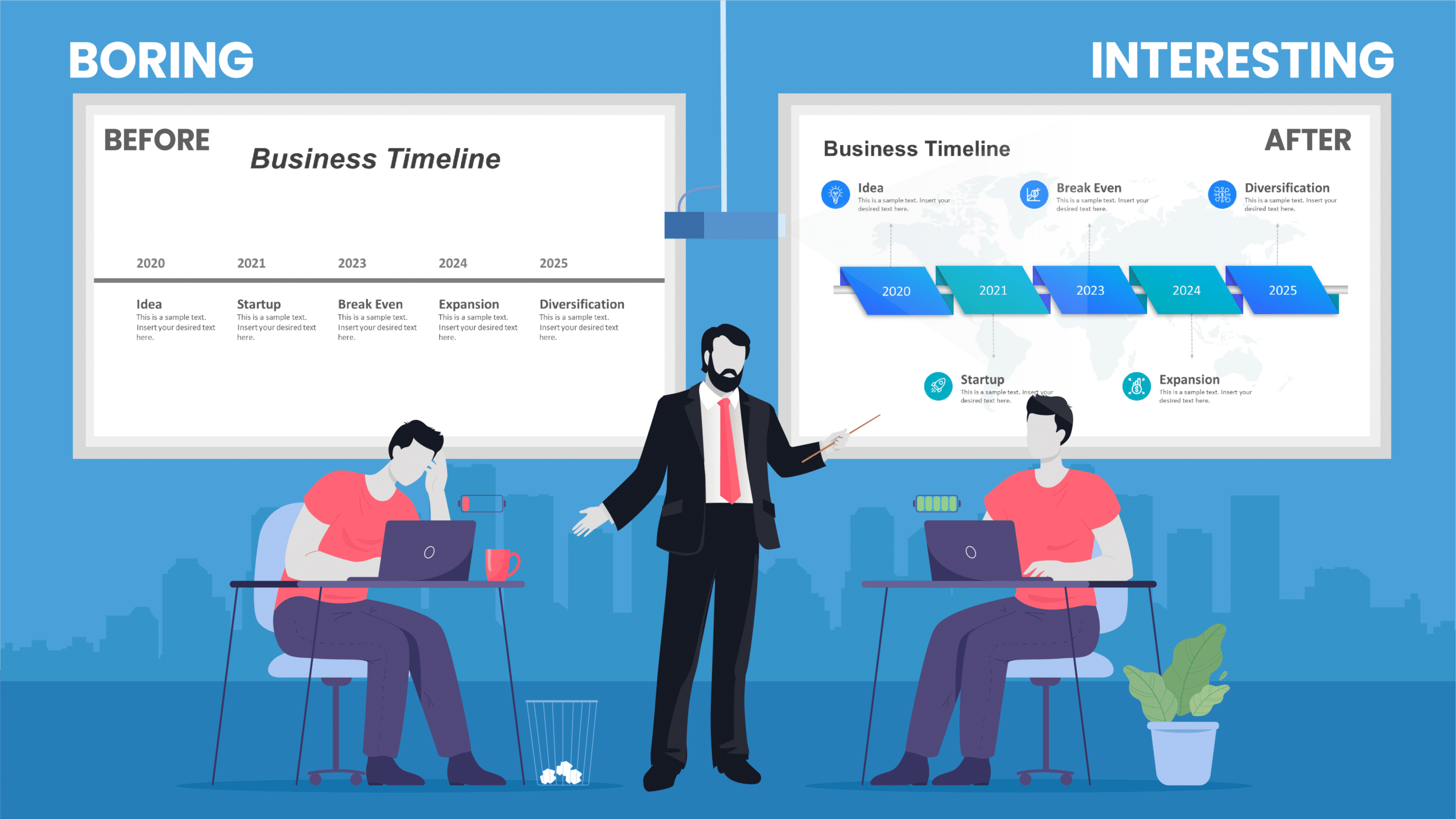
What Makes a Bad PowerPoint Presentation?
Everyone talks about good examples, but even a basic mistake can make your fantastic-looking presentation bad. Learning from really bad PowerPoint examples can be as valuable as following the best practices of good PowerPoint examples . Let’s walk through some of the bad PowerPoint presentation slides that would make your eyes ache and content so dull it could put an insomniac to sleep.
With these really bad powerpoint examples, you can save your presentation from being a disaster and turn them into engaging slides:
- Too much text on slides
- Too many animations
- Using too many colors on one slide
- Being too minimalistic
- Using only pictures and difficult-to-understand fonts
- Keeping the image behind the text
- Flow charts on the slides do not make sense
- No symmetry in texts and pointers
- Using only bullet points and no paragraphs
- Keeping the size of the font too small
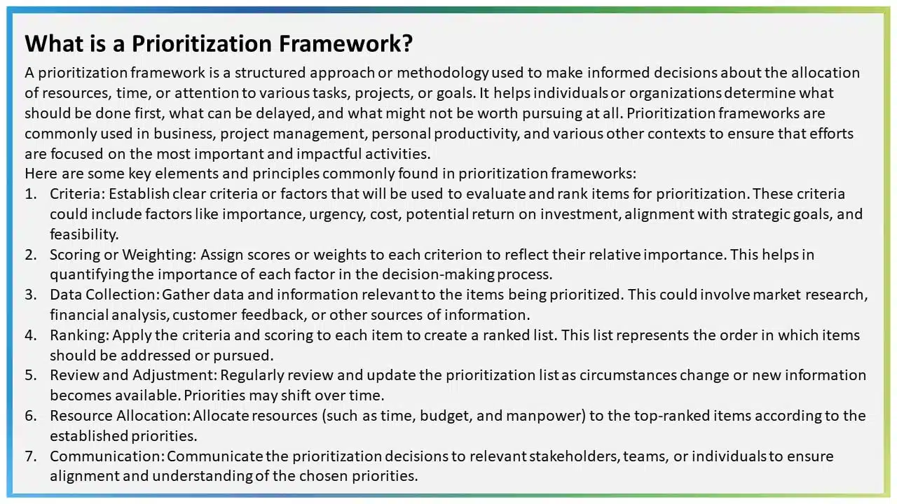
1. Too much text on slides
PowerPoint is a handy tool, but remember, it’s there to enhance your presentation, not steal the spotlight from you. The key here is to make it a visual assistant that doesn’t simply mimic your words but assists you in giving visual suggestions. Overloading your slides with text is the fastest way to make your presentations dull and monotonous. Those walls of text can instantly overwhelm your audience, and we’ve all been there, irritated by text-heavy slides.
Going further, scripting your entire speech on the slides can trip up even the smoothest talkers. We all know it seems easy to read word to word while giving presentations, but it kills the natural flow and direct interaction with your audience. Moreover, such text-heavy bad PowerPoint slides will result in a rigid, unengaging presentation and steal your spotlight.
Bad PowerPoint Slide Example with Excessive Text:
2. Too many animations
There are plenty of PowerPoint animations , and they can be tricky to use. There are more than 150 animations in PowerPoint, and some presentations seem determined to test them all. However, it is vital to note that using a lot of animations and transitions can make your presentations look less polished and outdated. When everything on a slide is animated, it can be distracting and even exhausting for your audience.
Moreover, excessive animations can be a headache for the presenter, too. If each element requires a click to appear or disappear, it’s not the most efficient approach, and it makes for a bad PowerPoint presentation example. Due to many animations and transitions, presenters inadvertently give away what’s coming next, disrupting their timing and distracting the audience, who start anticipating the next point instead of focusing on your words.
Bad PowerPoint Slide Example with Heavy Animation:
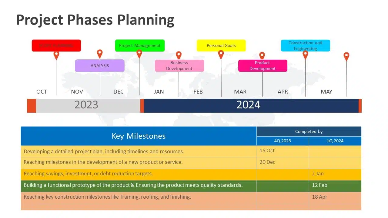
3. using too many colors on one slide.
Do not treat your PowerPoint presentation as a canvas. It is not a color pallet to mix and present different colors. Talking about color might seem like a deep dive, but you can be something other than a color theory guru to nail a good-looking presentation (though it’s a plus). Here’s the golden rule: KEEP IT EASY TO READ!
Bright and flashy colors like red or neon might not be your best bet for a presentation.
Also, think about contrast to ensure your audience can read effortlessly. Simple combos, like black text on a white background or vice versa, work like a charm. Conversely, white text on a grey background can be a readability nightmare. Having non-contrasting colors can make for bad PPT examples, and nobody wants colors in their presentation to clash, right?
Example of Worst PowerPoint Slide with Too Many Colors:
READ MORE: Effective Colour Palette Combination for Presentations
4. Being too minimalistic
Adding everything to your presentation is a problem, but not adding the required colors, graphics, and text is a bigger problem. It can make the slide look dull and empty. Sometimes, professionals can get carried away with the “less is more” idea. While using a variety of color palettes in one presentation can make it look unprofessional and strain the eyes, there are better options than going all-white.
Keeping presentations too minimalistic might give off the impression – that you didn’t put in the effort. Plain slides are an example of a bad PowerPoint presentation and don’t motivate the audience to pay attention.
Example of Bad PowerPoint Slide with Too Much Minimalism:

EXPLORE: 40,000+ PowerPoint Templates and Google Slides Themes
5. Using only pictures and difficult-to-understand fonts
Another example of bad PPT slides is cluttering the presentation with only graphics and difficult-to-understand fonts. Like with colors and animations, the “less is more” principle holds here. Your primary focus should be making your presentation easy to read and understand for your audience. Take fonts, for instance. Avoid ones like “Impact Typeface,” which have cramped letters. Fancy fonts, especially those that mimic italics, can be problematic too.
Example of Ugly PowerPoint Slide with Difficult To-Read Font:

READ MORE: Best Presentation Fonts
Now, onto images. Stay moderate; too many images can distract your audience significantly if they overlap. When considering multiple photos, ask yourself if you need them all or if one can represent the others. Slides with an excessive number of pictures can be a visual mess. While images are great for illustrating points and reducing text, an overload makes your presentation look outdated.
6. Keeping the image behind the text
Whoever thought of using an image as a background probably missed the memo. Images and text simply don’t go well together. Overlaying text on an image makes for one of the worst PowerPoint presentation examples. Keeping the image in the background makes reading the text complex, and the main image needs to be clarified. With the mix-up of colors in the background, finding a text color that stands out is nearly impossible, and all those colors just pull your attention away from the words. To save your presentation from this disaster, avoid using images as slide backgrounds when you’ve got text to showcase.
Really Bad PowerPoint Slide Example with Invisible Text:

EXPLORE: Best PowerPoint Backgrounds Collection
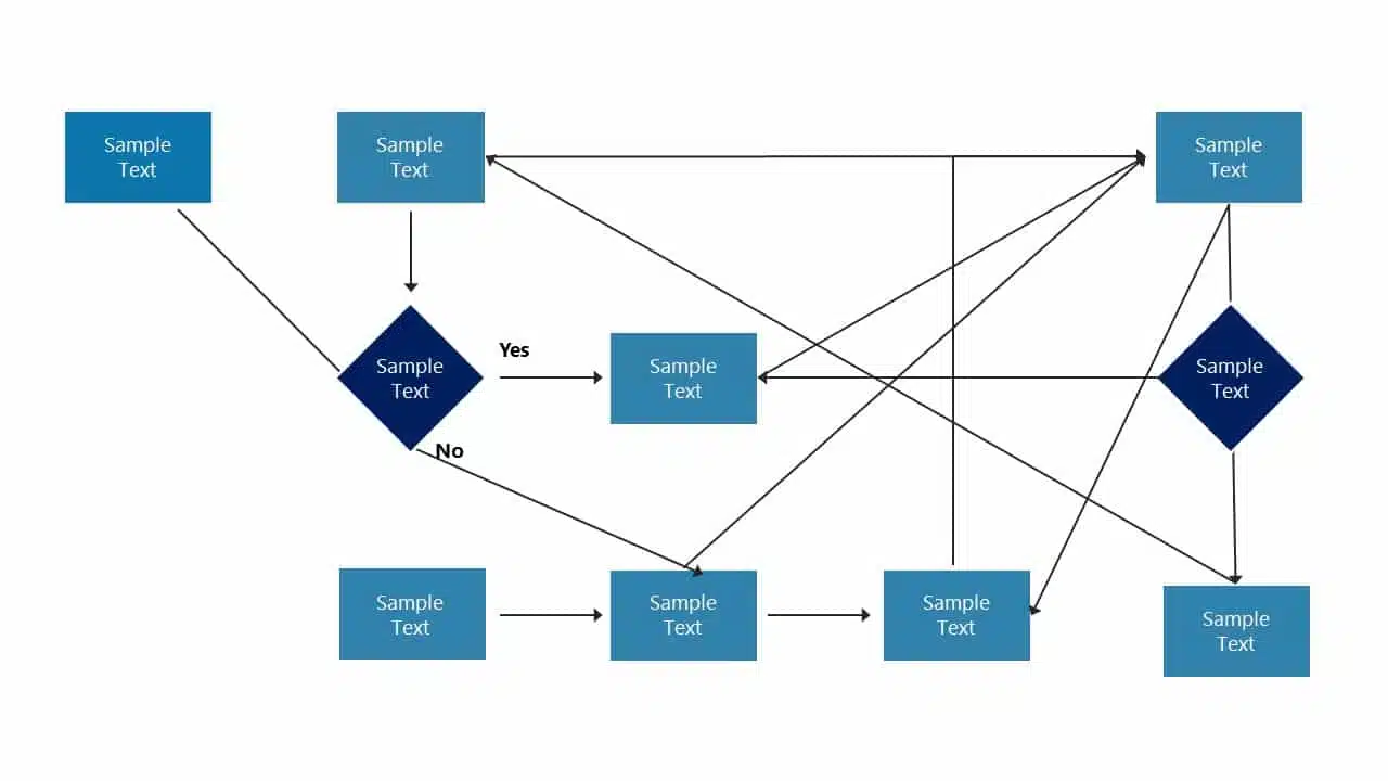
7. Flow charts on the slides do not make sense
If you want to use flow charts in your PowerPoint presentation, this one’s for you. The first rule for flowcharts is simple: they should be easy to understand. A flowchart can explain things in a presentation, but a well-crafted PowerPoint should make sense. The flowchart, like the one shown below, will destroy the look of your slide and needs to be clarified. By seeing this bad PowerPoint presentation example below, you need to help understand what’s happening. What is connected to what? Therefore, even if you intend to simplify the information, it will only reach your audience with a clear flowchart.
Bad PowerPoint Presentation Example with Messed up Flowcharts:
EXPLORE: Customizable Flowchart PowerPoint Templates
8. No symmetry in texts and pointers
The lack of balance or alignment between textual content and accompanying visual elements like arrows , bullets, or other pointers can make your presentations look unprofessional and unappealing. When text and pointers are haphazardly placed, it’s challenging for the audience to follow a logical flow of information, making up for a bad PowerPoint slide example. Without symmetry in your presentation, you’re only distracting your audience; they will be preoccupied with deciphering the relationship between the text and visuals.
Example of Bad PowerPoint Presentation with No Symmetry:

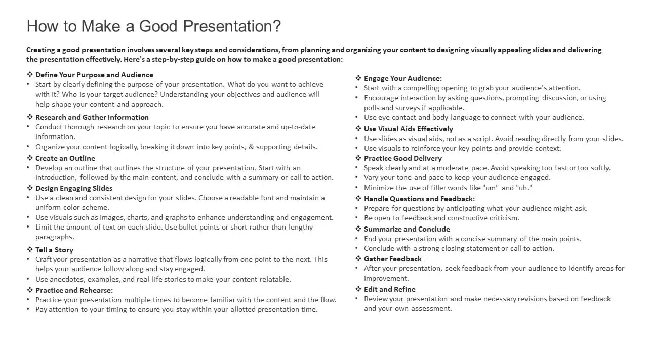
9. Using only bullet points and no paragraphs
Using only bullet points in your slide is one of the worst PowerPoint presentation ideas! In a PowerPoint presentation, simplifying paragraphs into bullet points is a smart move to make it more audience-friendly. However, it’s essential to clarify that this means more than merely slapping only bullet points and not including any paragraphs.
Here’s a helpful rule of thumb: “Only use 5-8 bullet points”, and if you find yourself shrinking text to 12 or 10 points, you’ve got too much text on your hands, and you can’t put all of it in the bullets. Having overly lengthy bullet points might not be to everyone’s liking, and some even read like full-blown paragraphs.
Ugly PowerPoint Presentation Example with Just Bullets and No Paragraphs:
10. Keeping the size of the font too small
Last on this list of bad PowerPoint examples is keeping the font size too small, making it look invisible. Font size plays a very crucial role in the presentation. Imagine being served a delicious pizza and handed a magnifying glass to find the toppings. Wouldn’t it kill the mood? The same applies to your PowerPoint presentation. Imagine everything in your slide is on point: the colors, the graphics, the animation, the information, but your audience can’t even read what you are presenting. A quick test is to stand at the back of the room where you’ll present, and if you can still read the font comfortably, then you’re good to go.
Worst PowerPoint Presentation Example with Small Font:

Tips to Avoid Making the Worst PowerPoint Slides!
Creating a standout PowerPoint presentation boils down to two fundamental principles: 1) it must captivate visually and 2) convey clarity of message. Sometimes, the temptation arises to favor one at the expense of the other. The absence of a delicate balance between engagement and transparency unites all these ugly PowerPoint slides examples. Here are some things you should keep in mind:
- Avoid stuffing slides with too much text in an effort for clarity, which often results in a boring, overwhelming presentation that distracts from the speaker.
- Refrain from overloading slides with excessive images or animations to boost engagement; it can backfire, resulting in confusion and an unprofessional look.
- Microsoft provides numerous resources to achieve a well-balanced look for your presentation, including colors, graphics, images, embedded videos, and animations. The key is to use them wisely.
- Before finalizing any presentation, you can ask a few questions from a spectator’s perspective. Can I replace this lengthy sentence with a picture or a keyword? Are the fonts crystal clear? Do the visuals or animations prove distracting? Are the colors harmonious, or do they strain the eyes?
READ MORE: Most Important Presentation Tips
You can craft an exceptional PowerPoint presentation by balancing engagement and clarity perfectly. However, striking this balance requires a lot of practice. The best and worst PowerPoint presentation examples clearly show how to keep this equilibrium.
As we’ve seen, it’s easy to take a presentation from good to worse by neglecting one side in favor of the other; the next time you’re gearing up to create a presentation, consider getting the help of professional presentation services .
Presentation service providers like SlideUpLift can help you strike the perfect balance of engagement and clarity, ensuring your audience stays focused while your message shines through. Whether you want to tweak every part of your presentation or adjust the fonts and colors, going for a presentation service provider like SlideUpLift ensures that your unique style is consistently reflected in your slides. You can book a consultation call to learn more about these services.
Explore SlideUpLift presentation design services to create eye-catching PPTs. You can give the custom-slides service a shot.
Why are bad PowerPoint slides a problem?
Bad PowerPoint slides can hinder effective communication, leading to audience disengagement and a failure to convey your message. They can distract, confuse, or even bore your audience, ultimately defeating the purpose of your presentation.
What common mistakes result in a really bad PowerPoint Presentation?
Common mistakes that result in bad PowerPoint slides include overcrowding slides with excessive text or complex graphics, using small fonts, lacking visual consistency, and neglecting the balance between engagement and clarity. You can avoid this by engaging your audience, conveying your message clearly, and creating a visually appealing and well-structured presentation that supports your content effectively.
How can I improve my PowerPoint slides and avoid making bad ones?
You must focus on simplicity, use visuals wisely, maintain consistency in design and fonts, and balance engagement and clarity. In addition to all these points, getting help from professional presentation providers can help you make top-class presentations easily.
. Are there resources or services available to help improve PowerPoint presentations?
Yes, SlideUpLift is one of the most trusted professional presentation service providers. They provide design and content layout expertise, including PowerPoint templates , Google Slides templates , presentation services , custom slide services , etc. You can book a consultation call with us to learn more about these services.
Table Of Content
Related presentations.
30 60 90 Day Plan PowerPoint Template
FlowChart Templates Collection Of PowerPoint & Google Slides
Arrows Templates Collection For PowerPoint & Google Slides
Related posts from the same category.

4 Oct, 2023 | SlideUpLift
The Best And Worst PowerPoint Presentation Examples
Engaging presentations are the lifeblood of effective communication in today's information-driven world. Whether you're in a boardroom pitching a new idea, standing in front of a classroom of curious learners,

23 Aug, 2024 | SlideUpLift
The Best PowerPoint Presentation Examples To Get Inspired By!
Engaging presentations are the secret sauce of effective communication. They bring life to your ideas and transform information into inspiration. They are the heartbeat of any memorable message, connecting with

22 Aug, 2024 | SlideUpLift
Best Professional Presentation Examples To Inspire You [+ Premium Templates]
It’s crucial for professionals to deliver outstanding and engaging presentations that convey essential information to their teams and stakeholders. Most professional PowerPoint themes are the backbone of corporate presentations and

22 Jul, 2024 | SlideUpLift
10 Best Financial Presentation Examples For PowerPoint
Presenting large data in a concise format in a presentation is just as important as it affects the efficiency of your business decision-making process. To make your work easy, we

21 Aug, 2024 | SlideUpLift
10 Tips On How To End A Presentation [Examples + Templates]
Everyone agrees that the beginning of a presentation is crucial as it catches your audience's attention and keeps them engaged, but what about the ending? The end of a presentation
6 Jan, 2020 | SlideUpLift
Top 10 Hacks On How To Make PowerPoint Presentation Attractive
Per experts, the audience gets hooked and pays more attention to the visual content of your PowerPoint slides than drab-looking, text-heavy content. This article answers the well to know question

8 Dec, 2023 | SlideUpLift
10 Best Presentation Softwares
Having access to appropriate presenting tools can benefit anyone, whether a business owner, a working professional, or a student. Using the best tools for presentations can increase the recall value

18 Aug, 2023 | SlideUpLift
10 Best PowerPoint Templates for Presentations
In today's landscape of the corporate industry, an effective PowerPoint presentation speaks volumes and is paramount. Presentations have evolved into more than just slides and bullet points—they've become powerful tools

11 Aug, 2023 | SlideUpLift
10 Best Marketing PowerPoint Templates
In today’s day and age, where communication is paramount and impressions are everything, a compelling marketing PowerPoint presentation can be the key that unlocks success. Whether you're aiming to captivate

13 Sep, 2022 | SlideUpLift
10 Ways To Make Interactive And Engaging Presentations In PowerPoint
Professionals across the spectrum will stand by the fact that compelling presentations can be an important force of influence at the workplace. Many people at the same time also struggle
Related Tags And Categories
Forgot Password?
Privacy Overview
Necessary cookies are absolutely essential for the website to function properly. This category only includes cookies that ensures basic functionalities and security features of the website. These cookies do not store any personal information
Any cookies that may not be particularly necessary for the website to function and is used specifically to collect user personal data via ads, other embedded contents are termed as non-necessary cookies. It is mandatory to procure user consent prior to running these cookies on your website.

IMAGES
VIDEO